Quick Route Planning
Start a ride in seconds with a lightweight route picker and clear ETA/terrain details.
Mobile cycling companion for routes, gear, and ride tracking.
Case Study
A streamlined mobile experience for cyclists who want fast planning and clear ride insights.
Project Overview
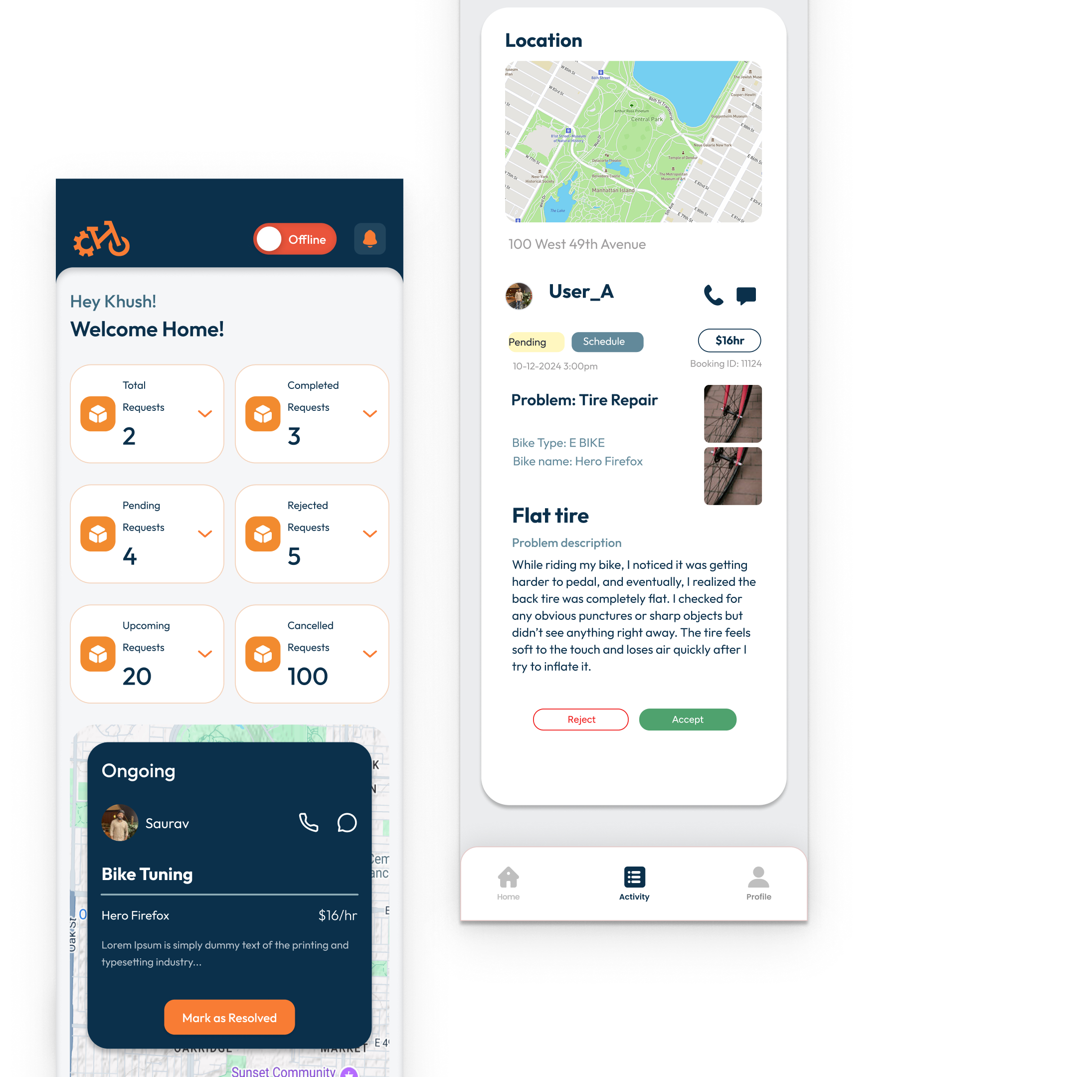
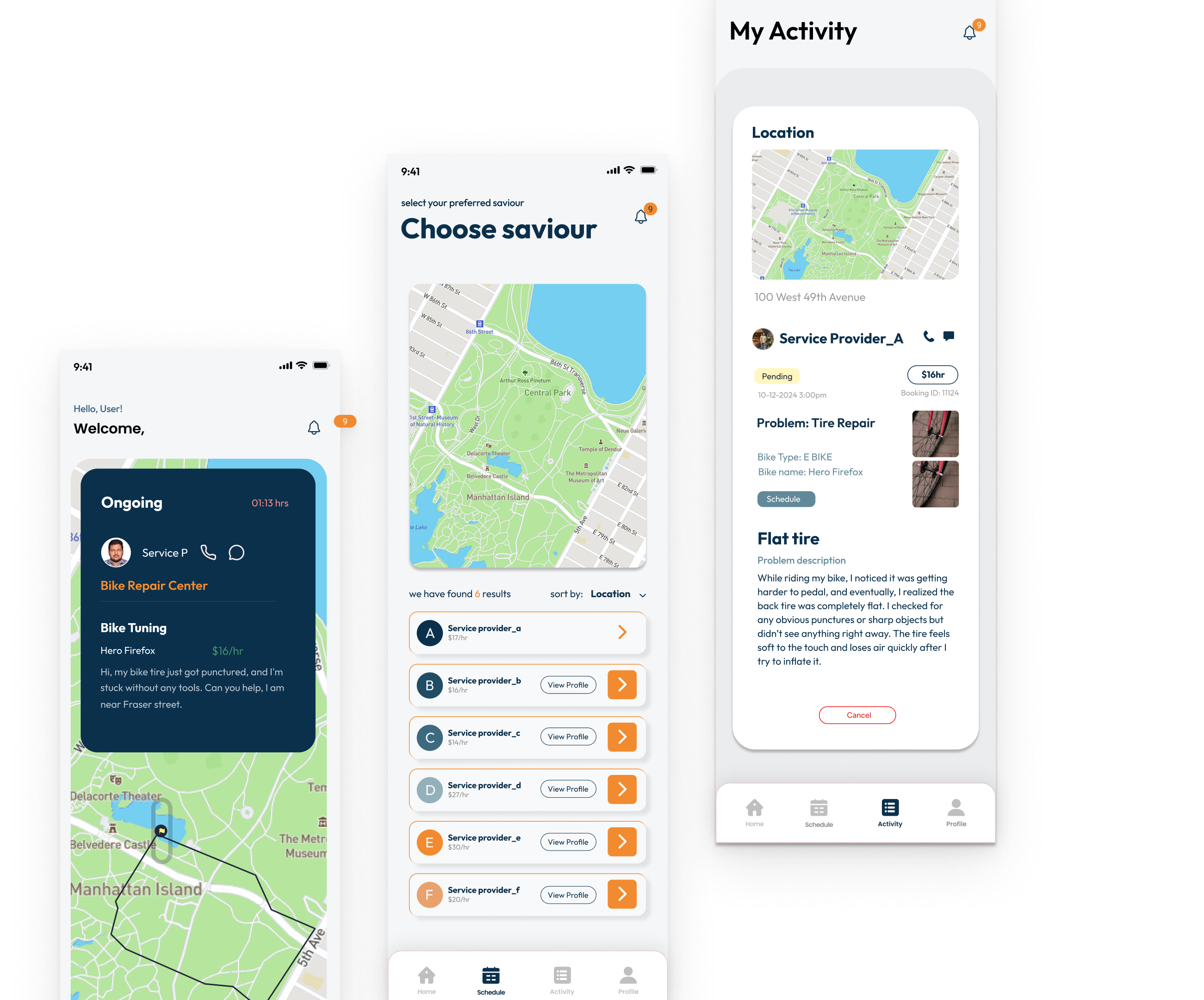
Pedal Patch brings route planning, ride history, and gear tracking into one clean mobile workflow. The concept focuses on fast access to routes, clear stats, and easy maintenance reminders.
Cyclists often use multiple apps for routes, fitness, and equipment, which makes it hard to stay organized and consistent.
Users want a simple, dependable flow for planning rides, tracking progress, and remembering gear maintenance without deep configuration.
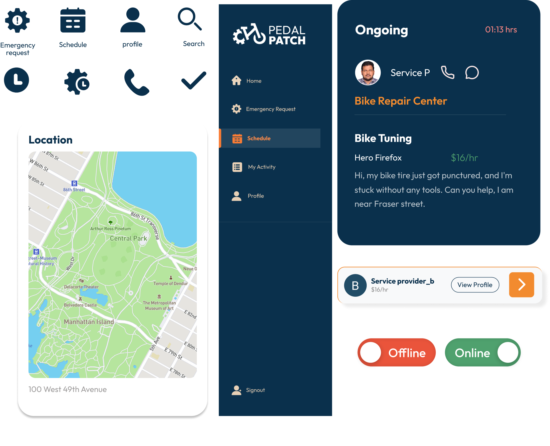
A focused, card-based UI that keeps planning and tracking simple. The system favors quick actions, high contrast, and minimal steps between intent and action.
Key Features
Start a ride in seconds with a lightweight route picker and clear ETA/terrain details.
Stats are summarized in scannable cards to highlight distance, time, and progress.
Keep equipment notes and service reminders tied to your ride history.
High-contrast cards and warm accents reinforce energy and motion without overwhelming the UI. The layout stays compact to keep attention on the next action.
Results & Validation
Reduced steps to plan and start a ride.
Ride details surfaced in a single view.
Focused navigation with fewer actions per screen.
UI/UX Designer
Duration: 8 weeks
Reducing steps and emphasizing visual hierarchy created a more confident flow for riders who want quick, reliable planning.