Program Clarity
Programs are grouped with clear levels, schedules, and benefits to reduce decision time.
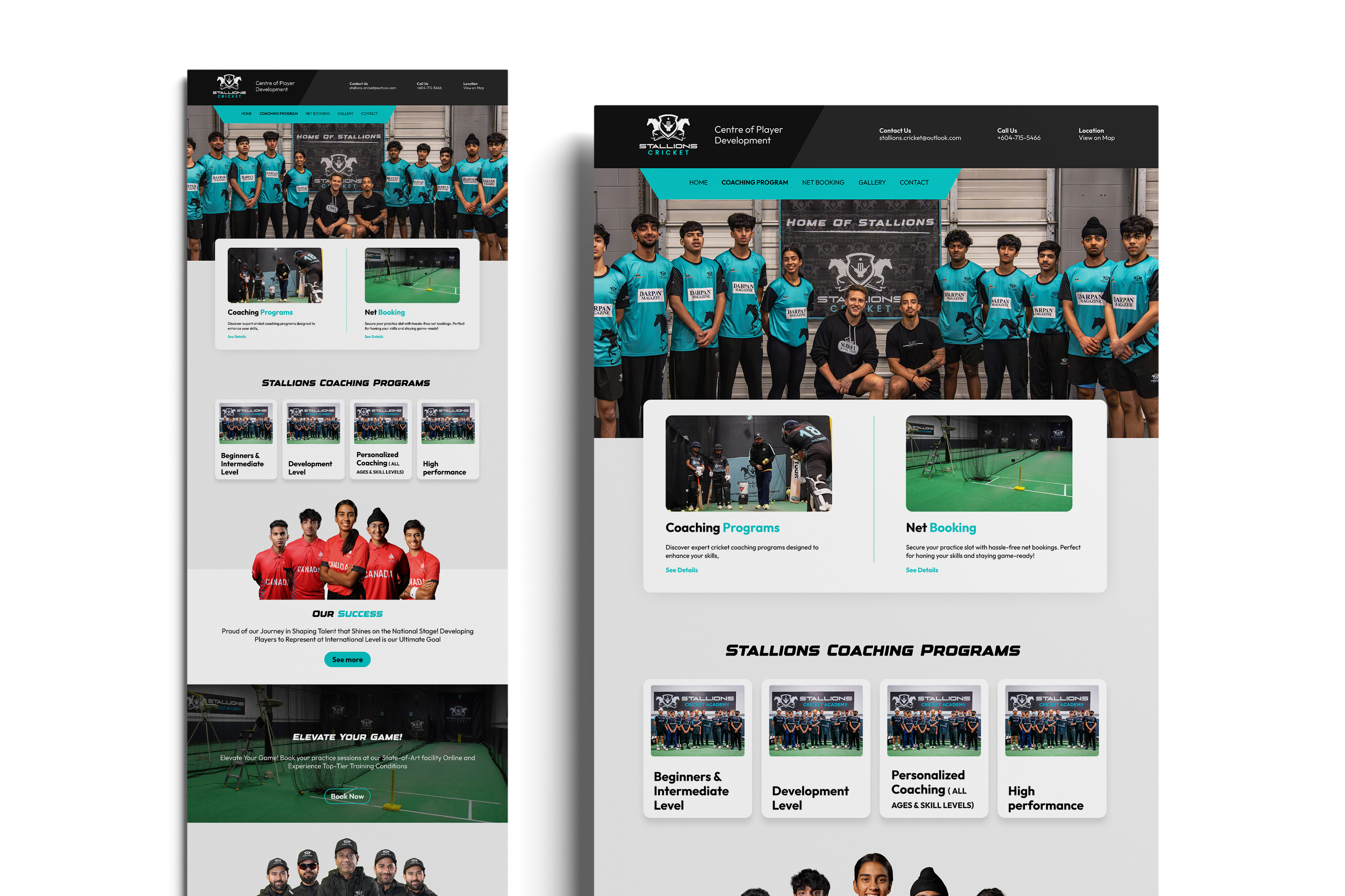
Conversion-focused refresh for registrations and program discovery.
Case Study
A modern marketing site focused on clearer program discovery and faster registration.
Project Overview
The Stallions Cricket Academy needed a refreshed website that made programs easier to understand and registration easier to complete. The redesign focused on clarity, strong calls to action, and trust-building content.
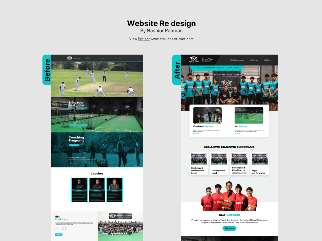
Visitors struggled to quickly find the right program and complete registration. The site needed a clearer structure and more persuasive content.
Parents and players want to know class levels, schedules, and coaching credibility quickly.
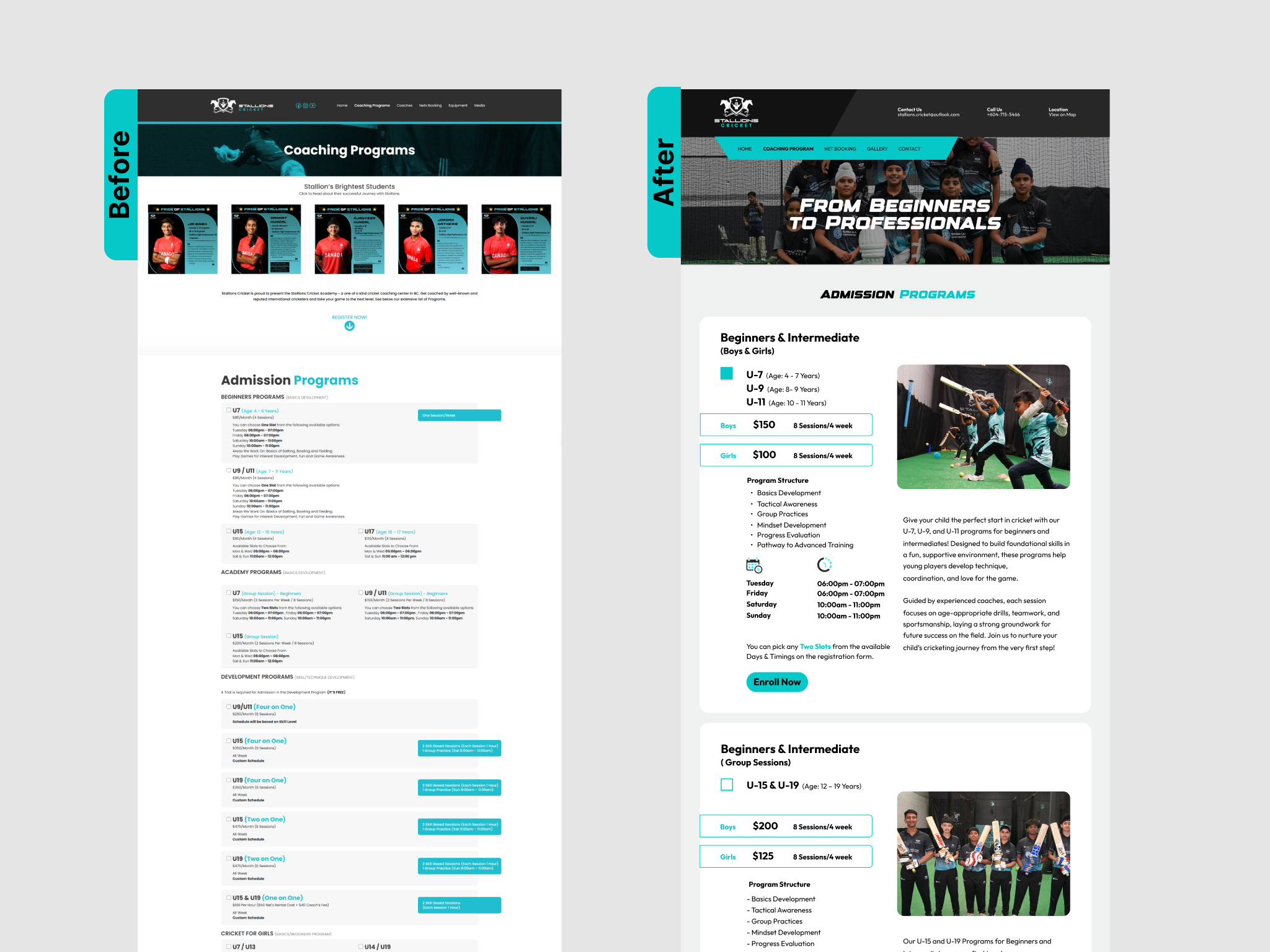
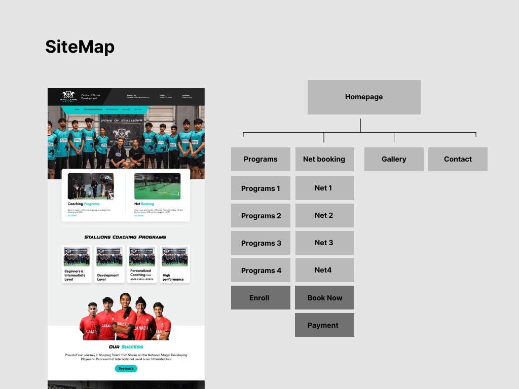
A refreshed layout with clear program groupings, strong CTA placement, and a simplified registration path.
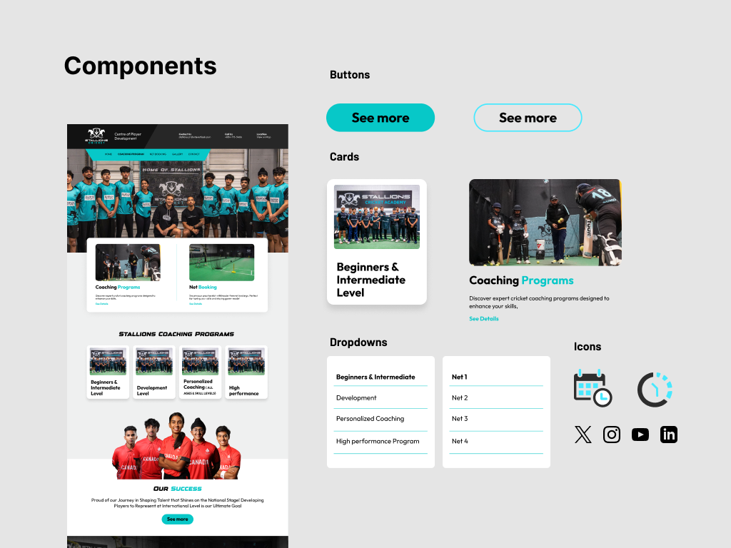
Key Features
Programs are grouped with clear levels, schedules, and benefits to reduce decision time.
CTA placement and simplified form steps make it easier to complete sign-ups.
Testimonials, coaching highlights, and event visuals build confidence on mobile.
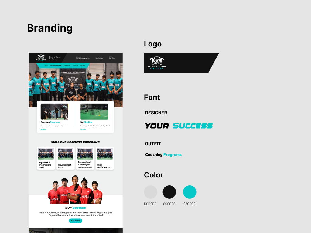
A bright, sporty palette and bold typography reinforce energy and community, while the layout stays clean and easy to scan.
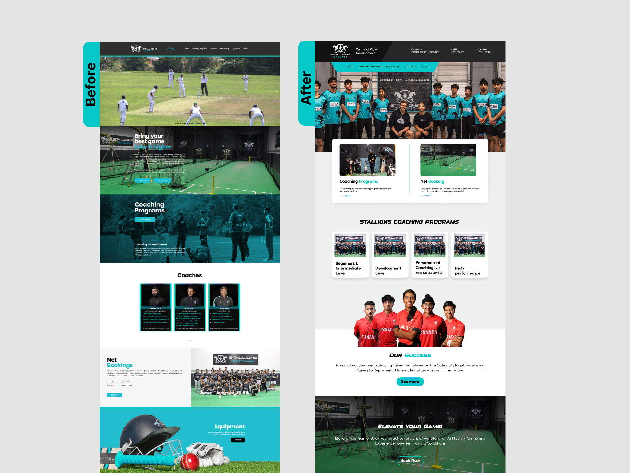
Results & Validation
Reduced steps to find the right program.
Higher visibility of registration actions.
Responsive layout optimized for parents on the go.
Web & Multimedia Designer
Duration: 6 weeks
Clear hierarchy and confident CTAs made the biggest difference in guiding visitors to act.